Another rainy, gloomy day in Georgia! It has rained every day this week! I am in desperate need of some sun beams!
I wanted to share a card I created for the The Card Concept and the Pals Paper Arts Challenges! I loved the sketch and wanted to step out of my comfort zone and create a graphic, clean and simple card. Clean and simple are the most difficult cards for me. I love layers and bling, so this card is very different for me. I am pleased with the result and I hope you will enjoy it, too!
Make sure to stop by each site to see what the Design Teams created. Their samples are amazing! Lots of great ideas and inspiration every week for you to enjoy!
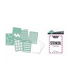
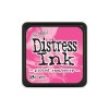
The first thing I did to create my card was use Pickled Raspberry Distress Ink by Tim Holtz. I applied the ink to the back side of the stencil, sprayed it with water and then turned it over on a piece of white paper to get the top panel. I really like this look. Such a quick and simple way to make your own Designer Series Paper.
The base card is white (10" x 5") scored at 5". I used Melon Mambo paper for the next layer. The gray triangle paper is from Heidi Swapp. I backed the watercolor panel with Melon Mambo, too. I found this THANKS die in my stash. It is from Taylored Expressions. It might have been a freebie in an order. I really can't remember. I cut a 1" strip from Basic Gray paper and clipped the ends to make the banner and the die was cut using Smokey Slate paper. The two silver brads are from Jolee.
Thank you for taking time to stop by my blog. I would love to hear your thoughts. Please leave a comment!
Wishing you a fabulous weekend!
Happy Stampin'!
Claire







Great background, Claire! I love your technique. I must give it a try, though it sounds a little messy, LOL!
ReplyDeleteSandy, thank you so much! It wasn't messy at all. Probably because the stencil was so small! LOL! XX
ReplyDeleteLove your graphic design, Claire. Your technique looks amazing…Melon Mambo & houndstooth, two of my favorites. It's always nice to see you in the gallery, thanks for joining us at the PPA this week!
ReplyDeleteYou captured the feel of the room fabulously - the colors and shapes. I can't wait to try your technique with my stencils, thank you for the tip. Hope you get some sunshine this weekend!
ReplyDeleteLOVE the DSP you created with the stencil! Awesome!
ReplyDeleteThank you for joining us at The Card Concept!
Fantastic card, & use of the inspiration photo! Thanks for playing along at The Card Concept!
ReplyDeleteFun, fun, FUN! Thanks for sharing the details on the how to's....I love the upbeat feel of the card - as always, many thanks for sharing your talent with the PPA!
ReplyDeleteVery cool background! Love this.
ReplyDeleteLove, love, love the clean & graphic look you achieved! Your homemade designer paper is really cool! Great interpretation of the challenge photo and great job stepping out of your comfort zone. Thanks for sharing at the Card Concept Challenge :)
ReplyDeleteThis is just gorgeous! I love your take on the inspiration pic! Thanks for joining us at The Card Concept!
ReplyDelete